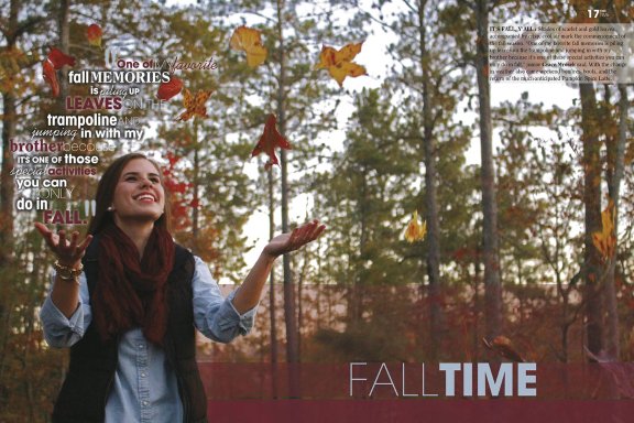
Including some of the fall colors can happen naturally through the photograph you take. In this spread by the Starr’s Mill High School Pride staff, PANTONE 18-1340 and PANTONE 14-0952 appear through the colors of the leaves, and a more intentional gradient bar behind the primary headline. Credit: Starr’s Mill High School, Fayetteville [GA]
Whether we like it or not, fall is slipping away. Our favorite part of the season is the variations of colors each year brings; dark oranges to light mustard tones. Taking nature’s cue in color combinations can bring an earthy, grounded tone to spread designs.
Early 2016, our friends at Pantone released their “Fashion Color Report” for the fall of 2016 with an homage to this grounded nature.
“The desire for tranquility, strength and optimism have inspired a Fall 2016 color palette that is led by the Blue family,” said Pantone Color Institute executive director Leatrice Eiseman. “Along with anchoring earth tones, exuberant pops of vibrant colors also appear throughout the collection … [which] act as playful but structured departures from your more typical fall shades.”
The Fall 2016 color palette contains a beautiful array of colors that provide a wide variety of color combinations. These colors can show up in a variety of ways throughout the yearbook — and can provide a subtle backdrop to your adopted theme:

Colorizing through nature

Blocks of fall color
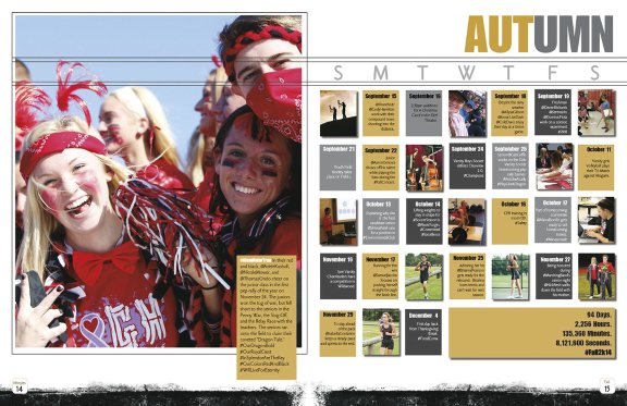
Color boxes can provide an easy way to include some of these inspiring colors. In this spread by the Kingsway Regional High School Lancer staff, they perfectly utilized PANTONE 14-0952 with a great contrast to the sky blue — closely resembling that of PANTONE 14-4122. Credit: Kingsway Regional High School, Wollwich Township [NJ]

Theme development
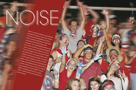
PANTONE 18-1550 shows up in this divider from the East Lincoln High School Retrospect staff. Whether intentional inclusion of fall color or just coincidental, the fall PANTONE 2016 colors can appear not just in a designated fall section, but rather throughout the book’s theme. Credit: East Lincoln High School, Denver [NC]
A world without
For many schools, PANTONE colors are not easily accessible; nor are they easily replicated without using a certain kind of ink. The colors you see above may not be exact replications of the true PANTONE color, but embody it’s essence and nature. What PANTONE provides us is a new way to look at color; extending our comfort with new combinations.
// SOURCES // Fall 2016 PANTONE Fashion Color Report. (2016). Retrieved October 5, 2016, from https://www.pantone.com/fashion-color-report-fall-2016
PANTONE® Colors displayed may not match PANTONE-identified standards. PANTONE® and other Pantone trademarks are the property of Pantone LLC. © Pantone LLC, 2016. All rights reserved. Produced under License Agreement between Jostens and Pantone LLC.
Written by:
Jason Kaiser
Associate Marketing Manager, Jostens
Jason works with various print, digital and social initiatives bringing content to life through Yearbook Love, the Digital Classroom and more. A former yearbook adviser, Jason has worked with scholastic journalism for more than eight years.


